Intro-
Propaganda and Protest have coexisted for many years...
Definition of propaganda posters
Definition of protest posters
Example
Propaganda-
View 1
View 2
View 3
Protest-
View 1
View 2
View 3
(comparisons)
Similarities/differences
Techniques
Conclusion- influence on modern society
Thursday, 22 December 2016
Tuesday, 20 December 2016
Image Analysis Essay Research
Another book that has been particularly useful has been Posters: A concise History which has some incredible examples of propaganda and protest. This had some good explanations about what different techniques and what a poster needs to be successful. I also researched many of the designs inside, looking for the three images I would use for the image analysis essay; some of the images below were found in this book.

- Although this image cannot directly be linked to protest art as it was made for a record company, the bold design and style are classic indicators of liberal freedom. This image wasn't used however as the link to protest poster work is too tenuous and there is little critical reflection on the work.

- This second poster was made by Seymour Chwast during the Vietnam war. This was an act of protest, designed to poke fun at the underlying motives of war and the bureaucracy. Its a form of satire and was considered anarchy. This image again had much potential for analysis and ties in with propaganda with its mocking style of the war posters at the time, however the design is too simple. The text, although powerful, is all it consists of. I hope to find an image that can be explored for its visuals as well as the caption.

- "Workless" made by Gerald Spencer Pryse in 1910 for the British Labour campaign. The visuals of this piece are incredible and led to it being exhibited in 1914, due to the incredible painting skills. This would have been another good piece to explore, however I thought it wasn't defined as definitely protest or propaganda. The piece came from a governmental source yet the content is incredibly radical and humanitarian, fighting against the government in power. I hoped to explore classic pieces of propaganda and protest, not a piece like this which is harder to define.

- This poster, produced by E V Kealey in 1915 for the First World War British army recruitment campaign, shows the increasingly sophisticated and commercialised strategies employed by recruiters to encourage men to enlist. Although this is a classic example of propaganda which could have been scrutinised entirely, its a piece that I have studied before and I thought I would lack interest. Also the piece is very gentle and persuasive, it doesn't use the 'fear' tactic which was used in war propaganda and could be interesting to analyse.

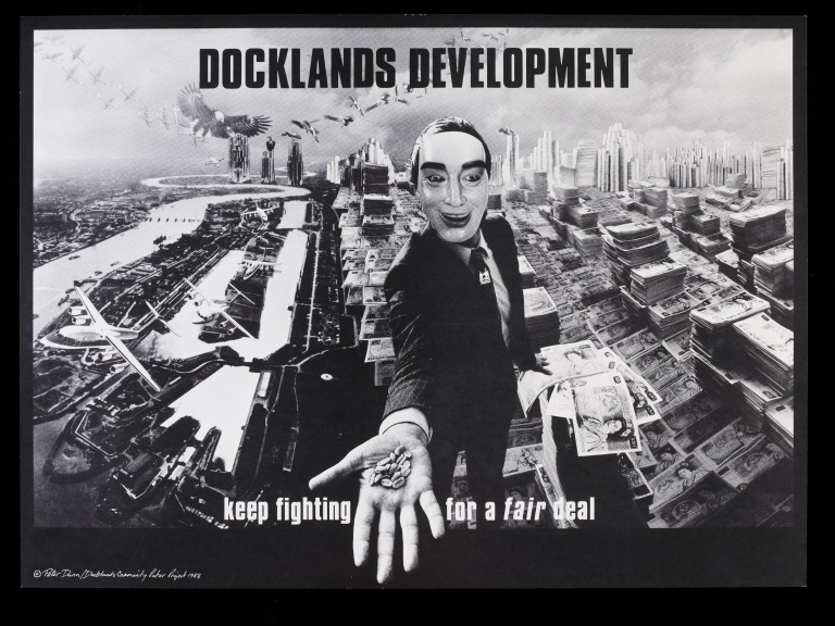
- Another poster campaign that could have been analysed was the Docklands Community Poster Project which was founded in 1981 by Loraine Leeson and Peter Dunn in response to the concerns of East London communities over an extensive proposed re-development programme. This was an important piece of protest and it stretched over many different people and could be considered a more contemporary example. This is a series I want to explore later in the project.


Final Images:
1. Hope by Shepaird Fairey (could look at Obey style as well)

2. Destroy this Mad Brute by H.R.Hopps

3. Your Body is a Battleground by Barbra Kruger

Wednesday, 7 December 2016
Propaganda: Truth and Lies in Wartime
I found this book in an art shop outside of Leeds randomly, yet the book was so inspiring I had to get it for my research. The book gives perfect examples of propaganda and depicts its history effortlessly. The designs although old, have descriptions that link them to different propaganda techniques and traits. This book should also prove useful for the second image analysis essay, for inspiration as well as context.


Thursday, 24 November 2016
Initial quotes and Research
Below are some of the quotes I have collated that have given me inspiration and and direction for my triangulation and referencing essay.
“Propaganda
marshalled the faithful. It did not win over the wavering or the
opposed.” (Curran and Seaton 1981)
Machoiavelli has said
“The great majority of mankind are satisfied with appearances, as
though they were realities, and are often more influenced by the
things that seem than by those that are.”
(Niccolo Machoiavelli)
One poster workshop put
it 'information to undermine all that other information- all that
$$$$'.
'Posters have to be
sharp, attractive and to the point, as well as exploiting ancient
prejudices, showing a good knowledge of how people think and using
the techniques that sway opinion.' (Husband 2014) pg 8
'Propaganda is as old
war itself, as old as politics and as old as the time when early
members of mankind first began to exchange threats and hurtful
words.' (Husband 2014)
“For the great
majority of mankind are satisfied with appearances, as though they
were realities, and are often more influenced by the things that seem
than by those that are.” (Niccolo Machoiavelli)
“Their interest in
issues of campaign must be secured by coordinating it with personal
interest.” (propaganda pg 117)
“Generally
pre-digested and made palatable for mass consumption.” (Barnicoat)
(posters a concise history.) Manipulation present is here, not just
playing on pre-existing values.
Edward Bernay's book
Propaganda was written in 1928 and outlined the theory of advertising
and publicity to the world. In the 1930s propaganda took on a more
sinsister meaning associated with the Nazi ministery of propaganda
and enlightenment. Which suggests why most of his theory outlines the
manipulation and his opinion that views are quite selfish in their
own gain. (Heller and Vienne 2012)
“[World War I] was
the most colossal, murderous, mismanaged butchery that has ever taken
place on this earth. Any writer who said otherwise lied, so the
writers either wrote propaganda, shut up or fought.” - Ernest
Hemingway
'some individuals of
high social status had little effect on other people's views, while
some of low status were important opinion leaders.' Katz and
Lazarsfeld study of women 'opinion leaders.' (Power without
responsibility)
… 'Personal influence
'intervened' between the message of the mass media and its reception
by the public. Consequently it impeded any attempt at mass
indoctrination.' (power without responsibility.)
''Being in control'
became, for many women, as much a matter of finding ways to exercise
control over their lives as of fighting back against controls imposed
on them or defending their achievements.' (McQuiston 1997)
'Visibility and
empowerment became words for the same goal: self determination and
nothing less.'
'1990s have been about
being angry and taking action: having something to say, and saying it
through fanzines, queerzines, electronic zines, music, email, faxes
or other forms of communications technology.'
The manipulation of public
opinion to accept the elite’s agenda.
http://vigilantcitizen.com/vigilantreport/mind-control-theories-and-techniques-used-by-mass-media/
'The state (or those in
power) need to have ways to control and influence the public whose
opinions – or sometimes lack of them – are relied on for
continued power. As Noam Chomsky has explained, governments and
businesses in liberal democracies cannot hold power over their own
people through force in the way that they could a century ago, so
“public relations” was invented, in order that those in power may
control the people. “Propaganda,” said Chomsky, “is to a
democracy what the bludgeon is to a totalitarian state.”1
www.studiointernational.com/index.php/world-to-win-posters-protest-revolution-review-mcmanus-dundee-v-a
Wednesday, 23 November 2016
Print Culture and Distribution 2
There is often some question as to why people still use handmade production methods when it comes to print. No one learns original or technical skills any more whilst we're in this easy digital age, whereas now learning slow production methods is rebellious against
today's society.
The Slow Food company suggest that by making a meal by hand, touching the raw material and feeling your
way around the recipe can be a soothing relief. Our current obsession with
speed means that we race though life instead of actually living it. Their
philosophy is not about doing everything in tortoise mode, it's more about investing the right amount of time and attention to
the problem. We need to escape the tediousness of fast-food and learn new skills
not to rely on consumerist order.
Whereas fast fashion consists only of pre-made mass-produced fashion styles where we're told what to buy. This
exploits consumer demand for novelties and follow the order of things. Slow fashion is where you're not
focusing on profit but the humanity and art of the clothing.
Slow
design is about how your design impacts culture and environment but is
individual at the same time. It is the progressive way of life that is almost post-capitalism.
Movements like
the Print Project explore revivalism and sustainability, maintaining history
and not reckless expansion. Their printing it is about the skills learnt not the profits to be made on a wider scale of mass production.
The Pink Milk Float talks to people who randomly pass by and teach them skills
in printing so they can invest and be involved within the process of print making.
This involves collaboration and not dictation of what you should be buying.
The possibility of a relational art (an art taking as its theoretical
horizon the realm of human interactions and its social context
rather than the assertion of an independent and private symbolic
space), points to a radical upheaval of the aesthetic, cultural and
political goals introduced by modem art.
horizon the realm of human interactions and its social context
rather than the assertion of an independent and private symbolic
space), points to a radical upheaval of the aesthetic, cultural and
political goals introduced by modem art.
Print Culture and Distribution Part 1
The term 'late age of print' comes from Marshall Mcluhan, which is what we are a part of. However the age of print began in 1450 and much has happened since then to get us where we are now.
The first art school in the country was Somerset House, named the 'Royal Academy.' This taught painting sculpture, architecture, music and poetry; this was only for the privileged but it was the gateway for learning design and using it on mass.
In fact the industrial revolution of 1760 to 1840 saw a boom for new industry and labour, causing the nature of society to change and created a noticeable segregation between the classes. The impoverishment and facilities of the working class meant a organic culture was created, for new affordable art and entertainment.
In 1820 John Martin began putting his work into an exhibition, charging people reasonable prices to see it rather than selling it on. This meant that art was no longer exclusively for the privileged, but available for everyone.
There was some opposition to this new found freedom, such as Mathew Arnold who wrote 'Culture and Anarchy' in 1867. This suggested that culture was something pure that had no agenda other than to control the working class. It has been considered that hate on commercial art derived from prejudices against the working class in the 1870s.
Black Bess was one of the first publications produced by the working class, for the working class. Eventually the Government commissioned schools of design, giving workers the studios for industrial commercialism. After the first one in London these spread to every province, Leeds College of Art was one of them.
People were also able to use new industry and machinery to fight back against systems of power and conformist culture. It also became a time of radical ideas that would create awe and innovation. For example, the Eidophusikon exhibition of 1781 used a darkened room which you could look through to see layers of moving set, actors, smoke and scent. This was an immersive sensory expiernce and was one of the first cases of moving image.
Eventually it became the case that anyone could be a visual communicator. By the new integration of photography- portraiture became a thing of the past. This lead onto print capitalism which transitioned pop culture in place of culture. Some think this is mindless and cheep, produced only for profit.
William Morris was a radical revolutionary of the era and strived for socialism and equality. Most of his work focused on nature not the current industry or slave labour. He even created the William Morris Works- at the Merton Abbey Mills, this was about print culture that was seclusive and collaborative- away from external power.
The first art school in the country was Somerset House, named the 'Royal Academy.' This taught painting sculpture, architecture, music and poetry; this was only for the privileged but it was the gateway for learning design and using it on mass.
In fact the industrial revolution of 1760 to 1840 saw a boom for new industry and labour, causing the nature of society to change and created a noticeable segregation between the classes. The impoverishment and facilities of the working class meant a organic culture was created, for new affordable art and entertainment.
In 1820 John Martin began putting his work into an exhibition, charging people reasonable prices to see it rather than selling it on. This meant that art was no longer exclusively for the privileged, but available for everyone.
There was some opposition to this new found freedom, such as Mathew Arnold who wrote 'Culture and Anarchy' in 1867. This suggested that culture was something pure that had no agenda other than to control the working class. It has been considered that hate on commercial art derived from prejudices against the working class in the 1870s.
F.R.Levis who wrote 'Mass Civilization and Minority Culture' suggested that popular culture is a form of addiction, almost like a drug. It makes you refuse to face reality whereas true art makes you confront the world. He also said ‘the
minority, who had hitherto set the standard of taste without any
serious challenge have experienced a ‘collapse of authority’, which was fundamentally true.
People were also able to use new industry and machinery to fight back against systems of power and conformist culture. It also became a time of radical ideas that would create awe and innovation. For example, the Eidophusikon exhibition of 1781 used a darkened room which you could look through to see layers of moving set, actors, smoke and scent. This was an immersive sensory expiernce and was one of the first cases of moving image.
Eventually it became the case that anyone could be a visual communicator. By the new integration of photography- portraiture became a thing of the past. This lead onto print capitalism which transitioned pop culture in place of culture. Some think this is mindless and cheep, produced only for profit.
William Morris was a radical revolutionary of the era and strived for socialism and equality. Most of his work focused on nature not the current industry or slave labour. He even created the William Morris Works- at the Merton Abbey Mills, this was about print culture that was seclusive and collaborative- away from external power.
Tuesday, 22 November 2016
Exploring Ideas for Studio Brief 2
Ways I Could Produce My Project Visually
- Produce parallels of propaganda posters and protest posters advocating the same message.
- Change well known propaganda posters into protest posters.
- Use modern day issues to create traditional propaganda- how the government still has an ideal citizen and specific behaviours they prefer.
- Could make the government a protest organisation, using posters with radical techniques.
- Produce corresponding propaganda with protest posters, depicted story between too forces. Could use same forceful styles and colour pallets.
- Posters highlighting how it can be extreme to manipulate views and possibly unethical.
- Change protest posters into a format that can be more ideological rather than manipulative (a zine for example, or a film.)
- Making propaganda posters for ridiculous ideas with persuasive techniques 'the bananas are going to take over the world.'
Sunday, 6 November 2016
OUGD401- Triangulation Research
Idea: To outline the differences between propaganda and protest art and how both have changed through time- in technique and ethics. So far I've done some research on propaganda and found how much of it is designed to be palatable. I could find contrasting views here and do more research on how protest art works- I imagine shock factor has a large role.


OUGD401- Finding Reasearch Resources
Potential starting quotes:
'History enables us to view ourselves and society in a proper perspective, to focus on human motives and the consequences of them for other individuals or for society, and to enhance our knowledge of the potential, as well as the limitations, of human actions.'
McDowell, M. (2001) Historical research: A Guide. London: Longman.
'What's miraculous is not that great graphic design, employing shock, wit, and clarity borne of urgency, can move people to action, to acts of courage and sacrifice, overcoming habit and fear. [...] What's truly miraculous is that, as hard as it is to make the perfect poster - and it must be immensely hard - someone nearly always seems to be on hand to do the job when the time demands it.'
Kushner, T., Glaser, M. (2006) The design of dissent. Beverly, USA: Rockport.
- Is it ethical to use graphic design to persuade people to go to great lengths of sacrifice?
- Propaganda used in wartime vs modern day.
- How we should use design for an ideology not an agenda.
- Difference between expression and manipulation.
- Propaganda vs protest.
- How women have used protest and persuasion for empowerment.

Chronologies 2: The History of Type- Production and Distribution
In 1919 Walter Gropius founded the Bauhaus school, bringing together creatives and engineers to
spark new age development in a growing industrial town after the First
World War. Their philosophy was that 'form follows function', the function of a product would drive the
appearance of it. The Bauhaus also focused on
simplicity- "less is more." To always design with a function in mind even if
the main function is to be decorative, which is still the current driving force for modern art education.
Pre-modern: the way it's always been, a systematic culture.
Modern: After the war people became innovative, following a line of "onwards and upwards."
Post-modern: No longer following a conventional route, often with a sense of irony or defiance.
In 1957 Miedinger designed Helvetica to function as a neutral typeface that had great clarity, no intrinsic meaning in its form, and could be used on a wide variety of signage.
The 50s to 90s was the new age for typographers to specialise in creating type. They designed using simple tracing paper and sketches. But after the 1990s the first Mac was created and type craft became democratised. Any individual was free to create design themselves and type and graphics suddenly became very common. For example, Vincent Connare in 1994 created Comic Sans !
Tim Berners-Lee created the world wide web so ideas could be spread for free to anyone. This eventually stimulated the modern use of emojis, which has almost become a common global language. This reaches back to that Greek idea of symbols being used to represent language, you could say we've gone full circle.
Post modernism began to grow when people like Jamie Reid and Vivienne Westwood began designing in the 70s. Punk culture grew, especially when Reid designed for the Sex Pistols; he got rid of the grid and began tearing up type. You could argue this was sparked by Dada, who were one of the first known movements to have no rules when it came to designing.
Still, the 70s began a new culture of commerce and collaboration, using photography widely for modern fashion. In 1979 Barbara Kruger created 'Your body is a Battleground' and in 1992 David Carson designed for Ray Gun magazine. Carson firmly believed in ripping it up and starting again to create something completely different.
Having a single approach no longer exists. We are in a culture of questioning and a culture of understanding. With limitless opportunities to engage with the world around us, there is always a new way to design.
Chronologies 1: The History of Type- Production and Distribution
Language is an agreement among a group of people that one thing will stand for another. We are the most
visually literate generation currently and typography is a modernist
obsession.
Type: what language looks like.
Typography: is the arrangement and appearance of print based matter to change legibility and give it durable visual form.
The only evidence of language is what's been written down throughout history, for example Egyptian hieroglyphics. 7000BC is around when we began writing things down, largely driven by trade and acknowledgement of trades. The Mesopotamia 3200 BCE was the introduction of a cuneiform system, where pictograms became conventional signs and the signs could indicate phonetic meaning.
The Rosetta Stone crafted around 196 BC represents three different languages and is the first known case of translation. Before printing, language was created by chiseling into clay to make a mark or through papyrus and ink for example. Styles of language was driven not only by speech, but the development of production methods too. Gutenberg in 1450 created the first movable printing press, although this had already been developed in China 600 years previous. This meant type could be created on a mass scale. One of the biggest turning points was in 1870 when William Foster made the elementary Education Act, making it mandatory that everyone be taught to read. This shifted Britain into a new age of mass production, people were constantly finding new ways to record type from this moment.
A 20,000 Year Non-Linear History of the Image
Image has been an integral part of
human life for thousands of years. One of the first preserved cases
of image being used to record events was within the Lascaux Caves in
France. There's something tribal and moving about these illustrations
that cause people to flock to them, even now.

Another case of powerful design is the transfixing
paintings inside the Rothko Chapel. Mark Rothko was a abstract
expressionist who painted to give a spiritual or emotional
experience. These paintings had many layers and drew light from the
room, causing a feeling of loneliness and oblivion.
Is it conformist to cry at something like this?
Has the institution dictated what we should emotionally connect to or
is it natural for humans to be harrowed by this. Certainly the
institution has some control, as the light and temperature were
changed to heighten the experience.

Is it the institution that gives a piece visual
importance? If graffiti is placed in an art gallery, it is no longer
graffiti. Graffiti should be seen unexpectedly and is partially about
rebelling against an order.
Jackson Pollock also used abstract expressionism
within his art, and was famous for capturing raw and fleeting moments
of the mind.

These works are highly valued, yet artists like
Roy Lichtenstein, who use very fine and precise line, have challenged
this. Arguing that random streaks of paint shouldn't have such value
placed on them. Yet I would say it is more about the freedom and
instantaneous power that people connect with in abstract
expressionism.

Another image that used a similar rawness and
caught the world by storm was the 'Peace for Paris' logo from 2014.
Perhaps people connected with it so much because it was a quick and
unthinking expression of the moment. Image can often have a lot of
power, and will sometimes communicate better than words.

Monday, 17 October 2016
Cop Lecture 1: Visual Literacy
Visual literacy means to construct
meaning from a visual image; to interpret, negotiate and make meaning
presented in the form of the image. This means you can play with
pre-formed associations (e.g. the toilet symbol can be manipulated,
as people already have an ingrained perception of what it already
means.)
In fact symbols can change meaning
because of the context surrounding them, for example colour can be a
large indicator. The different blocks of colour in flags can make a
huge difference to how we perceive them. Age can also be a
significant factor in the different associations we have for symbols,
which needs to be considered when designing something.
For language to exist there needs to
be an agreement amongst a group of people that one thing can stand
for something. Indicating that practically a symbol or colour needs
to have some significance and cannot be random. This idea was
developed in our ligature task, that a symbol usually must have
certain connection to its meaning.
Actually visual literacy is the
relationship between the visual syntax and visual semantics. Visual
syntax means the organisation of elements used to create the
image, whereas visual semantics is about how an image fits
into the cultural process of communication. This shows that the
design of an image must be composed to communicate. Other useful
vocabulary:
-Semiotics: study of sign and
sign processes.
-Visual Synecdoche: An aspect
of something to represent the whole (e.g. the statue of liberty is
used to represent New York.)
-Visual Metonym: How a
symbolic image can represent the literal meaning (e.g. how a yellow
cab can be used to conjure the literal image of New York.)
-Visual metaphor: To transfer
meaning from one image to another. Something unfamiliar associated
with something familiar (e.g. using word association.)
I believe at the core of visual
literacy there is an emphasis on using the associations we already
have to work new meanings into them. For example there was a 1970s ad
campaign for New York where an apple was used to create a healthy
association for the city. A preconception can subtly be used for a
new understanding- “work the metaphor.”
Subscribe to:
Comments (Atom)