I wanted to relate the messages of propaganda to vegetables, in order for it to seem ridiculous. By having dictators overly characterised it becomes clear how they shouldn't have the amount of power they do.


Colours were then added, starting with soft pastel colours to seem playful. Whereas there was then some experimentation with red and cream in order to connote Fairey's Obey style of design. This of course resembles propaganda with its use of colour, again making the satire more obvious.

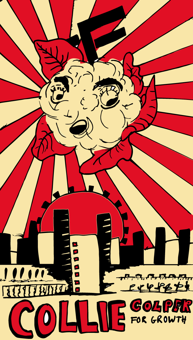
The problem with these designs is that we don't have an issue with propaganda like this in modern society. We certainly have posters like 'Hope' but they are never as aggressive as these vegetables posters portray them to be. In future I need to look at current regressed forms of propaganda, so that their persuasive language and use of emotive manipulation can be paralleled in poster form to reflect modern society. These designs are almost too goofy.
No comments:
Post a Comment