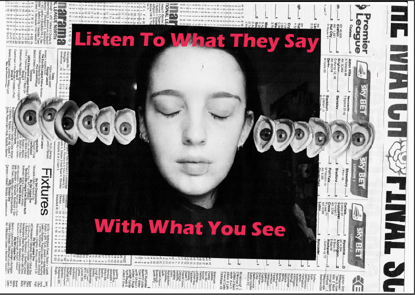
After
our class critique it became clear that a new typeface needed to be
found, the original design resembled Barbara Kruger's work too much
and the design need to have its own identity. After trialling Impact
it resembled a newspaper font too much and was not in keeping with
the collage style, it looked out of place.

Whilst Popla Std Black was a little more effective, it resembled 50s fashion magazines too much. With the collage style as well it became too vintage, especially with the type in a pink colour, it made it too 'pretty' for such radical content. This was also true for Cooper Black which can be linked to the type used for 'flower power' in the 70s. It made it too playful, when it needed to be both bold and powerful, yet modern and youthful.


No comments:
Post a Comment