https://issuu.com/hazelthacker/docs/cop_2_presentation
Monday, 24 April 2017
Final Poster Designs


These designs all follow a similar
style that fits well within the aesthetic of modern political
protest. In the group critique one of the main responses was that the
red, white and black colour scheme was successful. The monochrome has
seriousness to it, but the hints of red make it powerful. Similar to Kruger's style of protest which I have explored previously.
Typeface Development
After
our class critique it became clear that a new typeface needed to be
found, the original design resembled Barbara Kruger's work too much
and the design need to have its own identity. After trialling Impact
it resembled a newspaper font too much and was not in keeping with
the collage style, it looked out of place.

Whilst Popla Std Black was a little more effective, it resembled 50s fashion magazines too much. With the collage style as well it became too vintage, especially with the type in a pink colour, it made it too 'pretty' for such radical content. This was also true for Cooper Black which can be linked to the type used for 'flower power' in the 70s. It made it too playful, when it needed to be both bold and powerful, yet modern and youthful.


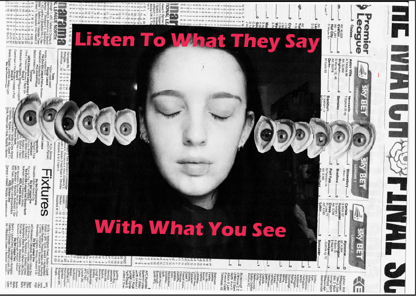
Statement Experimentation


For
protest posters, the statement is often as important as the design,
as discussed earlier. So for each of the designs dozens of statements
were trialled in order to find one that communicated the message but
also was memorable and had impact. For example the “eye spy”
statement trialled was too cliché, it didn't have the serious nature
the designs needed to have to compete at a university campus.
Collage Experimentation


Content development began by experimenting with overlaying biro on the collages, yet this appeared too aggressive. The collages needed to look carefully constructed, almost like surreal versions of reality.
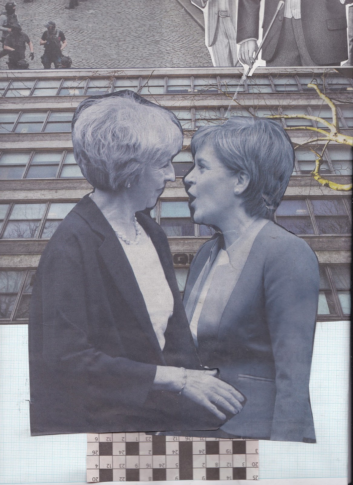
To reference the politics a collage was created featuring politicians, arranged in a radical position in order to connote the gay Marge law that Theresa May voted against. It was important to directly reference politics in this poster series as there needed to be a clear link to political branding which can be deceiving. Students are also very involved in politics and would respond to this, and the client, the society, is extremely involved in left wing politics.


Saturday, 22 April 2017
Examples of Current Propaganda
Below you can see modern cases of 'propaganda' and political persuasion. They key characteristics can be seen in every design, with key statements, persuasive and relatable stances, taps into what people dislike and fact has been exaggerated. The phrases used are casual and not written officially, e.g. 'Tories' or 'isn't', this maintains a casual approach for the audience. The viewer doesn't wan't to be intimidated and needs to already have opinions that align with those shown in the design.


Specific Characteristics of Propaganda
Observations from reading for the triangulation essay:
- There is a reward implied for the desired behaviour outlined (e.g. in the past it would have been going to heaven, or money, or security.)
- Popular trends of the period are reflected in the design.
- They are "Sharp, attractive and to the point."
- They can be very persuasive and identifiable.
- It has to appeal to the emotions.
- They display fact selectively and with exaggeration.
- Taps into fears, hopes and desires.
- Palatable to a vast audience.
- Something the public consciously or unconsciously wants to hear. Sometimes only those already in support can be reached by it.
- Also has to be considered it is used specifically for those who are opposed using fear tactics, suggesting consequences for lack of support.
Observations from research for the image analysis essay:
- They are often very directive, with a face or slogan addressing the viewer.
- Women are often depicted with beauty or elegance and in fact, generically attractive people are often to chose to represent political campaigns.
- There is usually a memorable statement, e.g. "Hope."
- There is a co-dependency between the caption and the picture, neither can work alone.
- Modern posters needs to be simplistic, so that can be built on top of and redeveloped. In this fast paced society posters needs to be redeveloped constantly to the new and growing situation.
Critique Feedback
After having feedback I decided to develop the propaganda style posters as they link to my research most. Overwhelmingly the main piece of advice was to look at the main techniques of propaganda and replicate them in a satirical style. It was also suggested I find modern instances of propaganda, that the Leeds Social Revolutionary Society would want to act against.

Prototype 3 Development
This was designed in order to hark back to the posters designs produced in the war period, but placed with a statement to make people question what they believe. It was inspired by the propaganda posters below:


This was designed to create a parody of what propaganda usually advocates, by directly saying "always believe what you're told" it immediately puts into question if you should. Although I want to develop this design it needs a lot of work. The women is meant to be raising her eyebrow, however the visual content doesn't seem to be enough to portray incredulity. In order to develop this further I need to study more propaganda and the techniques it uses and then implement them directly into poster designs similar to this.

Prototype 2 Development
For the second prototype there was influence from Barbara Kruger's style of collage. Although this is not as linked to the style of propaganda, it still asks people to not trust what they hear and encourages individual thinking.


Although this design uses more collage rather than Kruger does, it still resembles her style quite heavily. For this project to work it needs more individual designs to break away from what people have seen before; this is the only way to capture attention.


Although this design uses more collage rather than Kruger does, it still resembles her style quite heavily. For this project to work it needs more individual designs to break away from what people have seen before; this is the only way to capture attention.

This design can also be linked to the style used for the
‘demon eyes’ election poster deployed unsuccessfully by the
Conservatives against Tony Blair in 1997. The design uses a similar colour pallet and use of collage, although the meaning is very different. Perhaps the design could be developed to resemble something as aggressive and powerful as this, and then create a caption that has a completely opposite meaning.
Prototype 1 Development
Initial sketches:
I wanted to relate the messages of propaganda to vegetables, in order for it to seem ridiculous. By having dictators overly characterised it becomes clear how they shouldn't have the amount of power they do.
 They have been drawn to resemble a propaganda style with rays coming from the centre and jagged lines to symbolise power. The cartoon style of the vegetables it to maintain the quirky satire of the designs, yet with the powerful symbol in the background it reiterates the power of dictators. There was much experimentation to design a symbol that would communicate this, with power and notes of past regime symbols.


Colours were then added, starting with soft pastel colours to seem playful. Whereas there was then some experimentation with red and cream in order to connote Fairey's Obey style of design. This of course resembles propaganda with its use of colour, again making the satire more obvious.

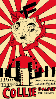
The problem with these designs is that we don't have an issue with propaganda like this in modern society. We certainly have posters like 'Hope' but they are never as aggressive as these vegetables posters portray them to be. In future I need to look at current regressed forms of propaganda, so that their persuasive language and use of emotive manipulation can be paralleled in poster form to reflect modern society. These designs are almost too goofy.
I wanted to relate the messages of propaganda to vegetables, in order for it to seem ridiculous. By having dictators overly characterised it becomes clear how they shouldn't have the amount of power they do.


Colours were then added, starting with soft pastel colours to seem playful. Whereas there was then some experimentation with red and cream in order to connote Fairey's Obey style of design. This of course resembles propaganda with its use of colour, again making the satire more obvious.


The problem with these designs is that we don't have an issue with propaganda like this in modern society. We certainly have posters like 'Hope' but they are never as aggressive as these vegetables posters portray them to be. In future I need to look at current regressed forms of propaganda, so that their persuasive language and use of emotive manipulation can be paralleled in poster form to reflect modern society. These designs are almost too goofy.
Wednesday, 19 April 2017
Ideas for Poster Designs

Ideas taken forward to develop:
- Vegetable parodies of propaganda.
- Collage, replacing eyes with ears. All about how we receive and understand ideas, how we perceive was it true.
- Illustrations in the style of past propaganda, using the techniques of propaganda but with policies taken too far.
Tuesday, 18 April 2017
Visual Research for Protest Posters
I began by looking at images that would inspire some inspiration for my project.
The Obey Eye by Shepard Fairey:


The Obey Eye by Shepard Fairey:
'Shepard
Fairey started out on his graffiti artist career with the Obey Giant
sticker campaign in 1989. His unique style is heavily influenced by
advertising and propaganda, which his work tends to criticize.'
'Fairey
was one of the first viral street artists, a powerful dissenter and,
eventually one of the most outwardly political artists of our time.'
'Fairey
intended the Obey Giant to inspire curiosity and cause people to
question their relationship with their surroundings. According to the
Obey Giant website, "The sticker has no meaning but exists only
to cause people to react, to contemplate and search for meaning in
the sticker". The website also says, by contrast, that those who
are familiar with the sticker find humor and enjoyment from it and
that those who try to analyze its meaning only burden themselves and
may condemn the art as an act of vandalism from an evil, underground
cult.'
https://en.wikipedia.org/wiki/Shepard_Fairey
http://omgposters.com/2009/04/16/obey-eye-art-print-by-shepard-fairey-onsale-info/

Use
your loaf- no-one is starving from lack of weapons by Peter Kennard:
"Use
your loaf - no-one is starving from lack of weapons".
Photomontage by Peter Kennard. UK, 1983.
He
is best known for the images he created for the Campaign
for Nuclear Disarmament (CND)
in the 1970s–80s.
'At
the time CND were still using images from the Ministry of Defense in
their campaigns, which Kennard believed lessened the effectiveness of
their message. He felt that CND were unaware of the power of using
art in their campaigns and began creating images for them. He also
wanted to challenge some of the images, produced during the
Cold
War,
that had become acceptable in popular culture. He felt photomontages
were a particularly effective way of tackling Cold War issues because
the messages contained within them were harder to manipulate.
Although Kennard created a great deal of work for CND, he was never
officially a member.'
'Kennard has been
heavily influenced by the Cold War, especially relating to anti-war
protests and nuclear disarmament. He has never been paid for any of
the artwork he created for protest groups. Instead, he wants to
encourage people to think about what is happening around them,
believing that artists with strong political views should express
them in their work.'
http://www.iwm.org.uk/history/6-powerful-protest-posters-by-peter-kennard
https://en.wikipedia.org/wiki/Peter_Kennard

Untitled (The future belongs to those who can see it)
'Informed by feminism, Kruger's work critiques consumerism and desire,
and has appeared on billboards, bus cards, posters and in public
parks, train station platforms, and other public spaces.'
'Barbara
Kruger is an American conceptual artist, often grouped with feminist
postmodern artists. She uses the techniques of mass communication and
advertising to explore gender and identity. Kruger is considered to
be part of the Pictures Generation.'
'She
layers found photographs from existing sources as magazines and using
her bold phrases to frame them in a new context. She said "I’m
trying to deal with ideas about histories, fame, hearsay, and how
public identities are constructed."'
https://www.artsy.net/artwork/barbara-kruger-untitled-the-future-belongs-to-those-who-can-see-it
http://worldofthewoman.com/future-belongs-can-see-barbara-kruger/


Monday, 13 March 2017
Design and Modernism
Modernism:
The range of ideas and style that have sprung from modernity and the
re-instigation of order and structure. Resonding to the qualities of
the modern world.
Modernism in Design:
- Anti-historicism: disregards the past and always involves improving and modernising for the future. (Can reference 'Ornament is Crime lecture' by Adolf Loos 1908.)
- Truth to materials: Using new materials for design (concrete, tech.)
- Form follows function: Solving the problem first which will create a thing of beauty as a result.
- Internationalism: A universal visual language of design, for example IKEA.
If
you try to make your work stylish or follow current trends, it will
quickly go out of fashion. To make something timeless you give it
pure functionality and strip it of everything else.
Skyscrapers
are considered modernist as they optimize the small space of land
they are given in order to build upwards. The glass is the best way
to let the light into the sometimes shaded plot and it is only
possible to construct because of modernist materials.
 |
| Seagram building. |
Additionally
for the Bauhaus concrete was considered a material of beauty and was
a big contributor to the beginning of the modernist era. Harry Beck's
London Underground Map is another example of modernism, as it is
purely a thing of function, not realistically recording the distance
between locations but helping direct you to them. It is all about
communication and legibility. This is a from of internationalism as
it can usually be understood by anyone and similar systems have been
replicated across the world.
After
the Russian revolution, the country hyper-modernised. The revolution
needed to be communicated to everyone in the country; including the
illiterate peasants who made up 50% of the country. This was the
reason for Rodchenko to create the 'Books!' poster, which followed a
modernist approach in its simple communication.
 |
| Books! by Rodchenko. |
One
of the main modernists of the time was El Lissizky who created a
poster called
Beat the Whites with the Red Wedge, 1919. The use of shape here is
timeless and worked to signify the power of the revolution to
everyone.
 |
| Beat the Whites the the Red Wedge, 1919. El Lissizky. |
He
was also famous for creating photograms which was a modernist
approach to photography, without actually using a camera.
 |
| El Lissizky photogram of pliers. |
Another
result of the Russian revolution was the plan to make a monument to
the Third International in 1919. This was to be 3x as big as the
Eiffel tower and revolve at separate speeds on different levels.
Although this was never made, the complexity and ambition the piece
signified was incredible of the time and shows modernist initiative.
 |
| The Third International 1919 |
Stepanova
and Popova were also key female constructivists in the Russian
revolution and were behind some strong and dynamic pattern design
that were a symbol of progression and empowerment.
 |
| Stepanova and Popova textile design. |
Finally,
it is important to consider that an entirely modernist city could
potentially lack a feeling of humanity, for there is no history. Le
Corbusier Plan Voisin was an utopian dream that all the buildings in
Paris would appear the same. This was a early communistic drive that
shows a overtly modernist approach. Although this would be practical
it would have no culture or individuality, it would serve function
before anything else. As humans we needed to be reminded of our roots
and our potential constantly.
 |
| Le Corbusier Plan Voisin |
Sunday, 12 March 2017
Colour Theory Research
Joesph
Albers
Joesph Albers entered the Bauhaus in 1920 aged 32, this was the beginning of
his career in colour.
Homage
to the square was his most signature series, encompassing over 1000
related works, which Albers began in 1949 and continued to develop
until his death in 1976. He chose the square because it's a single,
repeated geometric shape, which he theorised was devoid of symbolism.
This meant he could systematically and freely experiment with colour
relativity and the relationship different colours have with each
other. Including juxtaposition, placement, attraction and resistance
and finally movement. Different pallets can create different climates
and a selection of just three colours combined can show individual
moods and associations, different for every viewer. He worked
passionately on a range of optical and psychological effects that
colour can create, depending on their position and proximity with
each other. In fact he even suggested that colour,
rather than form, is the primary medium of pictorial language.
Albers's 1963 book Interaction of Color
provided the most all-encompassing analysis of the function and
perception of colour to date.
Johannes Itten
Johannes
Itten developed strategies as a teacher in the Bauhaus 1919 to format
strategies for successful colour combinations. He created seven
methodologies for coordinating colours using hue's contrasting
properties. These involved contrast in saturation, light and dark,
extension, complements, hue, primaries, warm and cold. This were
rules that can be used to create different types of form that will
have bold and exciting appearances, without having to go through such
a rigorous trial and error. He also developed the 12-hue colour
circle, which outlines primary, secondary and tertiary colours
showing the original colour and the different combinations it can
make moving around it.
Some
of the attributes for colour ranges include the changing of shade
(adding black to the hue,) tint (adding the addition of white) and
saturation (the hues purity as it neutralises to grey.) Despite the
multitude of colours we have available to us, designers often use a
very select few colours. Colour is often used very systematically in
design, pallets are found through libraries of swatches. These are
usually black, white and one or two other colours. This is to create
a strong and bold foundation for communication. A design can be far
more comprehensive with a limited pallet.
Graphic
design is about the construction of form and composition. Part of
this is the subjectivity of colour and how we can use it to reflect
or distort reality. We only see colour when light bounces off objects
or comes directly from a source and enters the eye. This is hard to
comprehend as it feels as if colour should exist as we exist. When in
darkness we are still as vibrant and complex as we are within light,
whereas colour ceases to be.
Our
use of colour is constantly shifting in our cultures and our history.
It evolves alongside our perception of society, as a collective and
as individuals expanding our own knowledge.


Subscribe to:
Comments (Atom)