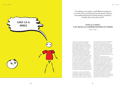
For the inside spreads I began creating spreads that would portray a simple style that wouldn't overshadow the text. These illustrations for the 'Give us a Smile' article were designed to be basic and brash, condensing the statements made by men such as 'nice tits' into the most primitive form of communication - stick people; commenting on the rudimentary language they use. The colours used are bold and bright, immediately holding the viewers attention, which is important for the magazine to compete with digital feminism.
For 'The Clever One or the Pretty One' I also chose a simple background to enhance the text. By using lipstick and concealer it meant that the tone of the article was set, whilst not being overwhelming or chaotic. The images have also been used full bleed, this means that the viewer isn't distracted when looking at them, and can appreciate a more personal relationship with the image. There has been some suggestion that on the last page the text box complicates the design and in order to make it more simple, the text should be formatted elsewhere. This is important to have a precise and organised aesthetic throughout.


No comments:
Post a Comment