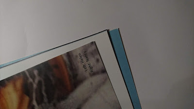
As Pender has said, 'details, atmosphere and colours call out in ways that they can't on screen' and 'print offers a different experience all together. It's sensory, the smell and the feel each add something different to the content.' (People of Print) And this is one of the main reasons magazines remain relevant. As a result, it became important to make sure that Headstrong offered such tactility in order to be successful.
I decided to use three different stocks in the magazine as Riposte does, in order to maintain a sensory experience throughout. The cover was a thick matte and the insides made up of a thinner matte and a thin gloss called 'digigreen silk'.
However, this created some issues in the printing process. The digital print room were using a new printer and the digigreen silk pages ended up having a lot of noise and discolouration. After some development this was improved, but not to an extent where the magazine appeared entirely professional.
The cover of the magazine also didn't have the clean and professional aesthetic I envisioned. In order for the cover to be double sided, a laser printer had been used which created uneven colour and a gridded texture. This did not match the tactile experience that my research had lead me to develop. As a result, I began considering how I could reprint the magazine in order to avoid using the laser printer for the cover and still create a luxoirous and tactile experience without using the digigreen silk stock.


No comments:
Post a Comment