Sunday, 16 December 2018

Practical - First Mockup Crit and Improvements

After several general comments about the magazine, such as the typeface of the headers and the typesetting of some paragraphs, there a more general discussion about the content of some of the spreads.

For the essay called "Your Nipple Should Be Here", I used photographs of fruit to indicate variety in body size. However, for this double page spread, once in was printed, the colour was far more dull. People suggested the red lines also weren't very visible on some of the darker fruit. So instead, in order to convey the theme of breast surgery I edited the image to appear faded and bright - almost like the experience of anesthesia. Whilst the red lines remained bright, making a bolder statement and taking into consideration the printing process.

Mockup 1
Final Design

Another element discussed previously was how the text box of this page detracts from the image, dulling its impact. As a result I developed the page so that the remaining text came underneath the image, encouraging a greater connection between the reader and the figures in the image. Allowing them to stand out and have impact - without being hidden behind a box.

Mockup 1
Final Design


This was a spread that I decided to delete from the magazine. The colour of the underwear was dulled by the printing process and the image quality felt unprofessional. It was also suggested that in all the previous essays the title has followed a certain format, not being placed on a double page spread, this however stuck out and didn't seem cohesive. Instead I developed it so that the title was placed on the following page, which appeared far more organised and considered. This was a spread that people agreed conveyed a far more concise message.

Mockup 1

Final Design

Again, linking to the previous spread, the image involving the underwear appeared in bad quality when printed, and didn't fit the general aesthetic of the magazine. As a result, the same style of the previous two spreads was adopted. Despite the fact the photographs took time to organise, in order for the magazine to appear more professional and cohesive, they needed to be cut.

Mockup 1
Final Design

One of the features I originally included was the 'Penpal' page at the end, to encourage readers to build a community and connect with other readers, as my research suggests that most successful feminists magazines are ones that nurture and develop strong community. However, from feedback it was suggested this page wasn't in keeping with the concept or aesthetic of the magazine. The publication is essentially a collection of feminist essays and the idea of having a penpal within the community doesn't entirely fit with that. Instead I developed it so that the final page offered readers the chance to write their own essays for the magazine. This offers community and keeps within the themes of the magazine. I also changed the page so that it was more minimalist, without a chaotic background. The layout is far more cohesive and means the writing isn't 'lost' within the composition.

I also wanted to include a quote on the last page, however in my initial mockup I wasn't using the Caslon typeface which I had used throughout the publication for quotes. It made far more sense to change it to Caslon, helping it have more personality and importance on the page. I also moved it onto a white background, as once printed the blue felt too dark for the quote to stand out.

Mockup 1
Final Design
Final Design

Pracitcal - Tactility, Production Development and the First Mockup

As Pender has said, 'details, atmosphere and colours call out in ways that they can't on screen' and 'print offers a different experience all together. It's sensory, the smell and the feel each add something different to the content.' (People of Print) And this is one of the main reasons magazines remain relevant. As a result, it became important to make sure that Headstrong offered such tactility in order to be successful.

I decided to use three different stocks in the magazine as Riposte does, in order to maintain a sensory experience throughout. The cover was a thick matte and the insides made up of a thinner matte and a thin gloss called 'digigreen silk'.

 
However, this created some issues in the printing process. The digital print room were using a new printer and the digigreen silk pages ended up having a lot of noise and discolouration. After some development this was improved, but not to an extent where the magazine appeared entirely professional.


The cover of the magazine also didn't have the clean and professional aesthetic I envisioned. In order for the cover to be double sided, a laser printer had been used which created uneven colour and a gridded texture. This did not match the tactile experience that my research had lead me to develop. As a result, I began considering how I could reprint the magazine in order to avoid using the laser printer for the cover and still create a luxoirous and tactile experience without using the digigreen silk stock.

Pracical - Content Developments

For the inside spreads I began creating spreads that would portray a simple style that wouldn't overshadow the text. These illustrations for the 'Give us a Smile' article were designed to be basic and brash, condensing the statements made by men such as 'nice tits' into the most primitive form of communication - stick people; commenting on the rudimentary language they use. The colours used are bold and bright, immediately holding the viewers attention, which is important for the magazine to compete with digital feminism.


 For 'The Clever One or the Pretty One' I also chose a simple background to enhance the text. By using lipstick and concealer it meant that the tone of the article was set, whilst not being overwhelming or chaotic. The images have also been used full bleed, this means that the viewer isn't distracted when looking at them, and can appreciate a more personal relationship with the image. There has been some suggestion that on the last page the text box complicates the design and in order to make it more simple, the text should be formatted elsewhere. This is important to have a precise and organised aesthetic throughout.

Practical - Grid Developments

After doing some research in 'Layout Essentials' by Beth Tondreau, I began to develop to the grid that would be used for the magaizine layout. From research, it has been suggested that magazines are still relevant because of their simple communication of information. As a result, I wanted to apply a grid that was simple and would make the images and writing the entire focus. Not too crowded or overwhelming, as this is the problem with current online communication.


From looking at other magazines on the market, it became apparent that having two columns for text is being commonly adopted at the moment. As Layout Essentials suggests, this means that there is enough negative space so that it allows the content to breathe. By having three columns it can be overwhelming. This grid layout also allows for single columns for information, in the center, which should allow for some variation in layout to keep the reader interested.

Practical - Typeface Development

After getting feedback on the initial experimental spreads I began to finalise the typefaces that will be used throughout the magazine. For the main body text, the sans-serf typeface Calibre has been used. This is because it is most important that the content is easy to read, since research suggests clear and concise communication is key, which is how magazines compete with digital communication. The header titles are also written in Calibre for this reason, in lowercase, however from feedback it has been suggested that this should be changed to match the logo typeface of Headstrong, ZapfHumunst, in order to feel more cohesive.

ZapfHumunst has been used for the titles of each essay as shown below, which is clear, bold and honest. The typeface itself has some serifs, but has been chosen for it simplicity.


Finally, Caslon has been used for the quotes outset in the text, this means there is some personality given to the quotes made by the authors, which is important for the reader to feel more connected to the writers. The serif typeface seems professional and traditional, creating some contrast with the sans-serif. As discussed previously, it almost suggests an intersection of traditional masculine and feminine aesthetics.


Practical - Page Arrangement

In order to organise the pages of the publication in an order that would fit together with the content I have been given, I decided to arrange them visually on a large scale. This meant that the pages could be rearranged and organised multiple times to fit the magazine's intended narrative. It also meant I was aware of how many pages I needed to design and how the different stocks would fit into this.

Practical - Study of Current Popular Magazines

The City Talking

The City Talking is a free magazine that celebrates cities based in Leeds. Although it can't be considered a feminist magazine, it uses an interesting and relevant aesthetic that engages readers and is a good example of a successful, local publication.


The magazine uses pastel pink pages throughout the magazine, creating a soft, minimalist aesthetic. This is something that could be experimented with as a typical approach to feminist design - taking ownership of the colour pink.

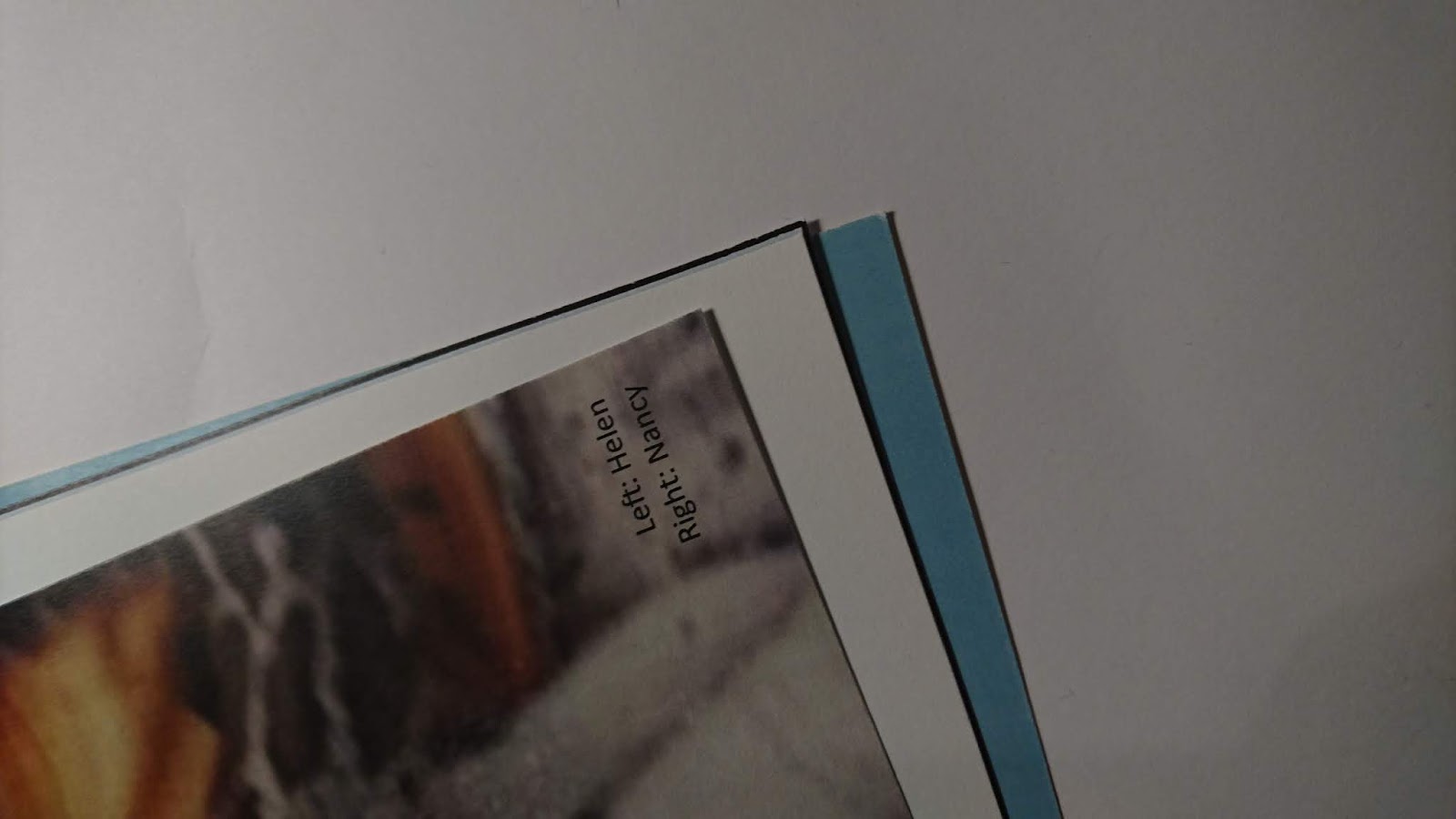
Another page I thought was interesting was the second below, modelling a concept of beauty and filtering, the image is placed within a black frame. This really emphasises the image and lets it speak for itself. It attracts more attention that the simple image on a white page tradition. This is something I have experimented with by putting illustrations within black frames. This approach hopefully creates something more visually intriguing and stimulating.


Headstrong experiment with black frame
Another thing I found interesting about the magazine was the use of stretched typography for this issue. Every title has an elongated letter within the title. This feels incredibly playful and does create something more experimental and interesting than communication of information online. However, Pender, editor of Riposte, suggests that 'typographic tricks' can sometimes detract from information. Sometimes it is better to design something that is legible and traditional in order to make the information and imagery stand out more than the magazine aesthetic/design. In fact, Self, editor of the alternative magazine Real Review, has said that their magazine is purely a vessel for the information they're trying to convey. That being said, these titles do make the magazine stand out against others, creating themselves a visual identity - which in some ways might be equally important.


Another element I found interesting was the penultimate page which had an information box, styled like something you might see online, suggesting the reader should get in contact with the magazine. It uses a 'username' box and underneath it has boxes for 'remember me' and 'remember my password'. Since my essay is exploring the rise of digital communication over magazines, it feels like an interesting exploration of a digital method of communication, in a print setting. However, in some ways, this might negate from the authenticity and value of a print publication. People are turning to print because it offers a break from digital media, so it possible magazines need to push aesthetics that are far from digital design. One of my first initial sketches was to make a magazine that uses a digital designs and layouts in a print setting; but through research I realised that print still exists because it offers something entirely different to digital media.


Vice: The Power and Privilege Issue

Vice is a Canadian-American print magazine that focuses on arts, culture and news, this particular issue felt relevant for my research as its content is focusing on power and privilege, an important theme in feminist work. The cover immediately demonstrates this chaotic typographic style that is seen throughout the magazine. Although I have discussed previously about how experimental type in magazines can detract from the content of the magazine, this typography feels part of the content - more than 'decoration'. This is not something I want to adopt for Headstrong, as my aim is for it be organised and clear, with the information being formatted for the best possible readability. But in many ways perhaps Vice are attracting more attention to their information by making it in this unusual, intensive way.


Another thing I thought was interesting, similar to The City Talking, many of the pages adopt this pastel pink for backgrounds. Vice also uses a pastel green and blue intermittently. Rather than using white pages throughout, this alternation in colour means that the reader's attention is held better. This is something I want to experiment with in Headstrong, especially as these pastel tones seem to be a common aesthetic for current art magazines. 


Another interesting feature was the fact it included images on top of images, this felt like an interesting way of backing the pictures with context and depth. However, in some respects it means that the attention detracts from the center image - you look at the composition as a whole rather than focusing on the women in the image. For Headstrong it is important that the images and text speak for themselves, placing emphasis on the personal experience of the individuals. Lacy suggests that by using feminist design to reveal private and personal experiences it can 'influence cultural attitudes and transform stereotypes.' So the design should optimise the personal connection between the viewer and the figure within the image. The image should be bold and stand alone. This overlaying aesthetic might be more interesting to experiment with for the cover, rather than the articles.