Saturday, 22 April 2017

Specific Characteristics of Propaganda

Observations from reading for the triangulation essay:
  • There is a reward implied for the desired behaviour outlined (e.g. in the past it would have been going to heaven, or money, or security.)
  • Popular trends of the period are reflected in the design.
  • They are "Sharp, attractive and to the point."
  • They can be very persuasive and identifiable. 
  • It has to appeal to the emotions.
  • They display fact selectively and with exaggeration.
  • Taps into fears, hopes and desires.
  • Palatable to a vast audience.
  • Something the public consciously or unconsciously wants to hear. Sometimes only those already in support can be reached by it.
  • Also has to be considered it is used specifically for those who are opposed using fear tactics, suggesting consequences for lack of support. 

Observations from research for the image analysis essay:
  • They are often very directive, with a face or slogan addressing the viewer.
  • Women are often depicted with beauty or elegance and in fact, generically attractive people are often to chose to represent political campaigns.
  • There is usually a memorable statement, e.g. "Hope."
  • There is a co-dependency between the caption and the picture, neither can work alone.
  • Modern posters needs to be simplistic, so that can be built on top of and redeveloped. In this fast paced society posters needs to be redeveloped constantly to the new and growing situation. 

Critique Feedback

After having feedback I decided to develop the propaganda style posters as they link to my research most. Overwhelmingly the main piece of advice was to look at the main techniques of propaganda and replicate them in a satirical style. It was also suggested I find modern instances of propaganda, that the Leeds Social Revolutionary Society would want to act against.

Prototype 3 Development

This was designed in order to hark back to the posters designs produced in the war period, but placed with a statement to make people question what they believe. It was inspired by the propaganda posters below:


This was designed to create a parody of what propaganda usually advocates, by directly saying "always believe what you're told" it immediately puts into question if you should. Although I want to develop this design it needs a lot of work. The women is meant to be raising her eyebrow, however the visual content doesn't seem to be enough to portray incredulity. In order to develop this further I need to study more propaganda and the techniques it uses and then implement them directly into poster designs similar to this.


Prototype 2 Development

For the second prototype there was influence from Barbara Kruger's style of collage. Although this is not as linked to the style of propaganda, it still asks people to not trust what they hear and encourages individual thinking.


Although this design uses more collage rather than Kruger does, it still resembles her style quite heavily. For this project to work it needs more individual designs to break away from what people have seen before; this is the only way to capture attention.


This design can also be linked to the style used for the ‘demon eyes’ election poster deployed unsuccessfully by the Conservatives against Tony Blair in 1997. The design uses a similar colour pallet and use of collage, although the meaning is very different. Perhaps the design could be developed to resemble something as aggressive and powerful as this, and then create a caption that has a completely opposite meaning.

Prototype 1 Development

Initial sketches:

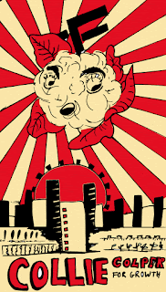
I wanted to relate the messages of propaganda to vegetables, in order for it to seem ridiculous. By having dictators overly characterised it becomes clear how they shouldn't have the amount of power they do.

They have been drawn to resemble a propaganda style with rays coming from the centre and jagged lines to symbolise power. The cartoon style of the vegetables it to maintain the quirky satire of the designs, yet with the powerful symbol in the background it reiterates the power of dictators. There was much experimentation to design a symbol that would communicate this, with power and notes of past regime symbols.


Colours were then added, starting with soft pastel colours to seem playful. Whereas there was then some experimentation with red and cream in order to connote Fairey's Obey style of design. This of course resembles propaganda with its use of colour, again making the satire more obvious.


The problem with these designs is that we don't have an issue with propaganda like this in modern society. We certainly have posters like 'Hope' but they are never as aggressive as these vegetables posters portray them to be. In future I need to look at current regressed forms of propaganda, so that their persuasive language and use of emotive manipulation can be paralleled in poster form to reflect modern society. These designs are almost too goofy.

Wednesday, 19 April 2017

Ideas for Poster Designs


Ideas taken forward to develop:
  • Vegetable parodies of propaganda.
  • Collage, replacing eyes with ears. All about how we receive and understand ideas, how we perceive was it true. 
  • Illustrations in the style of past propaganda, using the techniques of propaganda but with policies taken too far. 

Tuesday, 18 April 2017

Visual Research for Protest Posters

I began by looking at images that would inspire some inspiration for my project.

The Obey Eye by Shepard Fairey:

'Shepard Fairey started out on his graffiti artist career with the Obey Giant sticker campaign in 1989. His unique style is heavily influenced by advertising and propaganda, which his work tends to criticize.'

'Fairey was one of the first viral street artists, a powerful dissenter and, eventually one of the most outwardly political artists of our time.'

'Fairey intended the Obey Giant to inspire curiosity and cause people to question their relationship with their surroundings. According to the Obey Giant website, "The sticker has no meaning but exists only to cause people to react, to contemplate and search for meaning in the sticker". The website also says, by contrast, that those who are familiar with the sticker find humor and enjoyment from it and that those who try to analyze its meaning only burden themselves and may condemn the art as an act of vandalism from an evil, underground cult.'

https://en.wikipedia.org/wiki/Shepard_Fairey

http://omgposters.com/2009/04/16/obey-eye-art-print-by-shepard-fairey-onsale-info/


Use your loaf- no-one is starving from lack of weapons by Peter Kennard:

"Use your loaf - no-one is starving from lack of weapons". Photomontage by Peter Kennard. UK, 1983. He is best known for the images he created for the Campaign for Nuclear Disarmament (CND) in the 1970s–80s.

'At the time CND were still using images from the Ministry of Defense in their campaigns, which Kennard believed lessened the effectiveness of their message. He felt that CND were unaware of the power of using art in their campaigns and began creating images for them. He also wanted to challenge some of the images, produced during the Cold War, that had become acceptable in popular culture. He felt photomontages were a particularly effective way of tackling Cold War issues because the messages contained within them were harder to manipulate. Although Kennard created a great deal of work for CND, he was never officially a member.'

'Kennard has been heavily influenced by the Cold War, especially relating to anti-war protests and nuclear disarmament. He has never been paid for any of the artwork he created for protest groups. Instead, he wants to encourage people to think about what is happening around them, believing that artists with strong political views should express them in their work.'

http://www.iwm.org.uk/history/6-powerful-protest-posters-by-peter-kennard

https://en.wikipedia.org/wiki/Peter_Kennard


Untitled (The future belongs to those who can see it)

'Informed by feminism, Kruger's work critiques consumerism and desire, and has appeared on billboards, bus cards, posters and in public parks, train station platforms, and other public spaces.'  

'Barbara Kruger is an American conceptual artist, often grouped with feminist postmodern artists. She uses the techniques of mass communication and advertising to explore gender and identity. Kruger is considered to be part of the Pictures Generation.'

'She layers found photographs from existing sources as magazines and using her bold phrases to frame them in a new context. She said "I’m trying to deal with ideas about histories, fame, hearsay, and how public identities are constructed."'

https://www.artsy.net/artwork/barbara-kruger-untitled-the-future-belongs-to-those-who-can-see-it

http://worldofthewoman.com/future-belongs-can-see-barbara-kruger/